Challenge
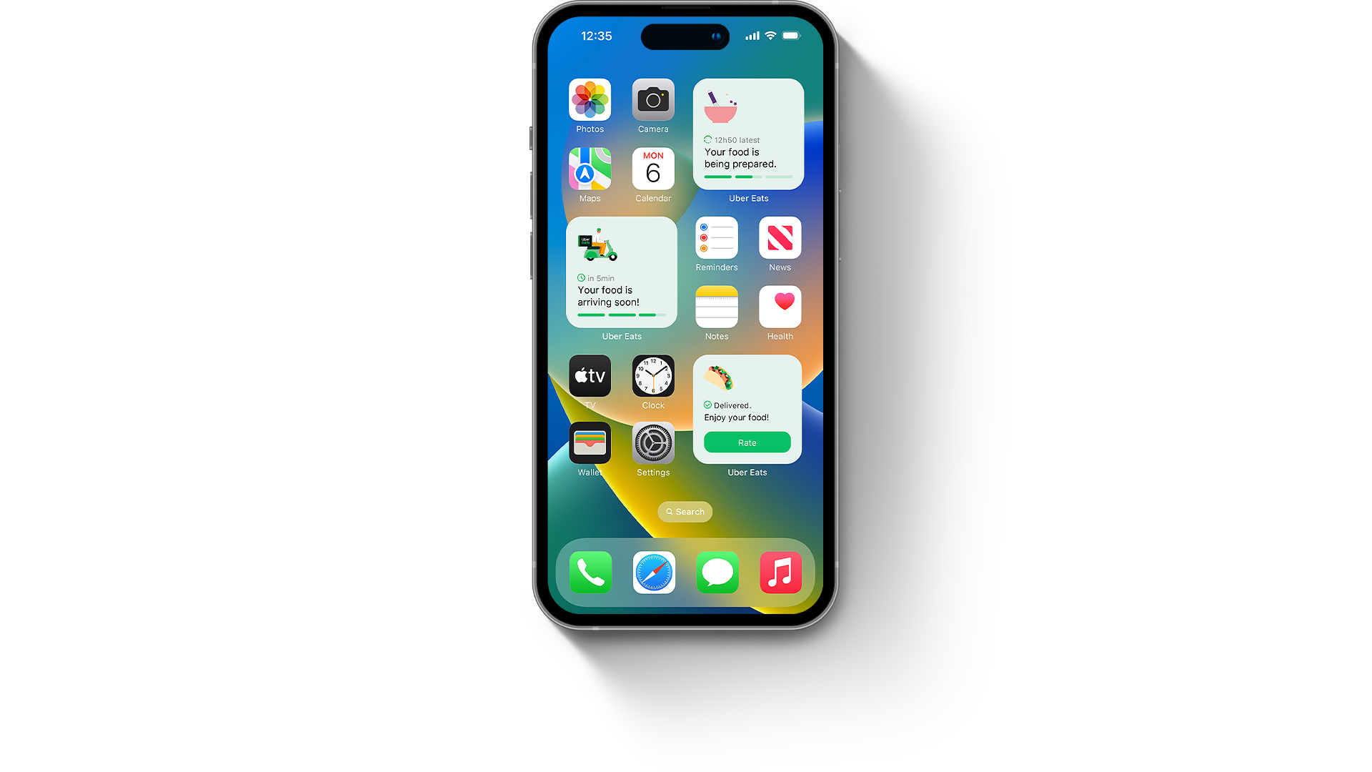
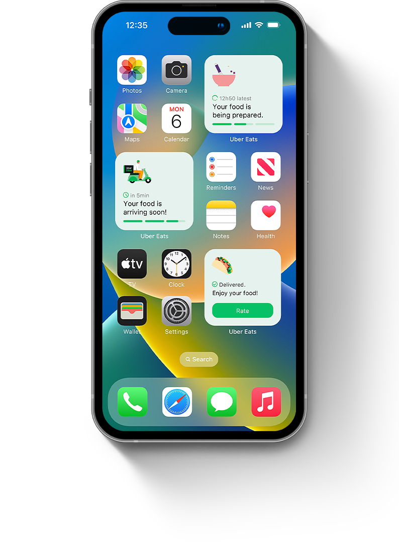
Uber Eats still does not have widgets, so I decided to create some but with a twist. Instead of showing static informations, they would update based on your order.
This project showcases my design process and is not linked to Uber Eats nor those widgets were implemented. Just some homemade fun stuff.


iOS widgets
Apple has released Home Screen widgets with iOS 14. They are a great way to get personnalised informations from your prefered apps. You can pick from different sizes and arrange them how you like.
Source: Apple.
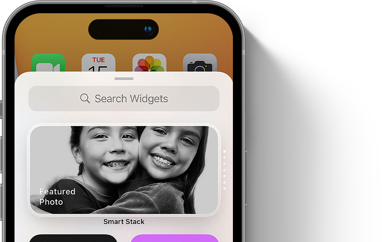
You can add a Smart Stack of widgets intelligently curated based on the apps you use most, and the right widget will show up automatically at the right time in your day.
The app
I believe that delivery apps have an opportunity to show informations on the homescreen for a specific use case only when you need them, without even opening the app or awaiting notifications: once you’ve ordered food and want to know the status at a glance.
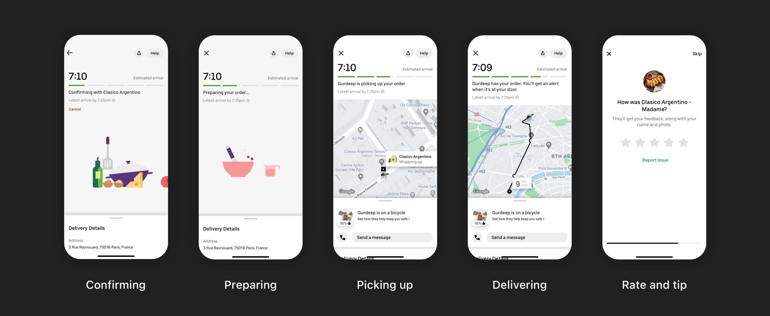
We first need to understand how the app and the steps work.
The data
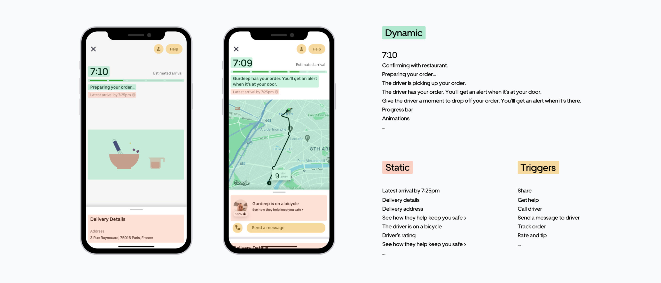
Now, let’s dive a little bit further, by categorizing the different types of informations and triggers shown:
Dynamic: content that updates until you receive your food.
Static: all “frozen” informations that won’t evolve during the process.
Triggers: call-to-action for getting further informations.
What to remove, what to keep?
Adding too many infos would not add value to the widget and would overload the screen. Remember that a widget is supposed to give precise informations at a glance, at any given time. From there, it’s easier to prioritize the informations we want to show:
1- Current status of your order,
2- Estimated and latest arrival time,
3- Triggers (track order, call driver, rate and tip…).
"It is important to do such upstream work to grasp the stakes of designing a relevant widget and not miss anything that adds value for the people using it."
Wireframes
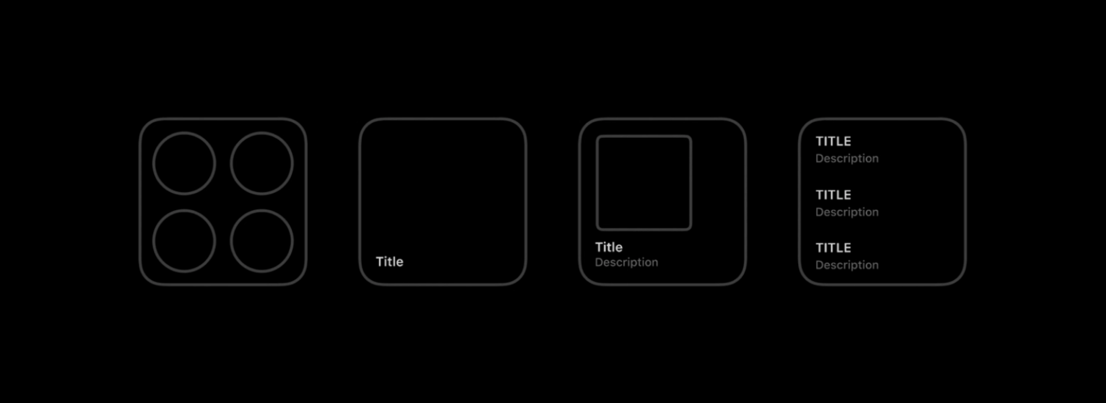
Now that we know which data to start with and have a better idea of the constraints and structure, let's start with the exploration phase:
What do we want to show?
Which information need to be the most impactful?
What is the visual hierarchy?
What can we add for more context?
…
Hierarchy
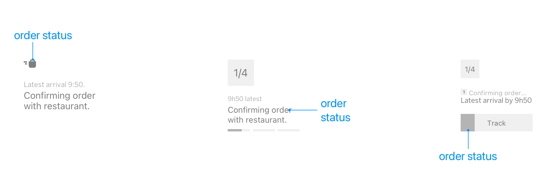
To create a visual hierarchy, I divided the space into 3 blocks: The current order status as an illustration, the text block with the ETA as a status and the 3-steps progress bar for the status. The same information is then duplicated 3 times…
Why then?
I’ve been taught that duplicating data overloads the interface and increases the cognitive load. I also believe that adding relevant elements help the user to contextualize what he has done and what is about to happen.
Emphasizing each steps with illustrations that people are familiar with (The utensils, ingredients, whisk, moped… -> the ones in the Uber Eats app) and a progress bar helpsreassuring them and getting a glance at what is going on. Same data, but represented differently.


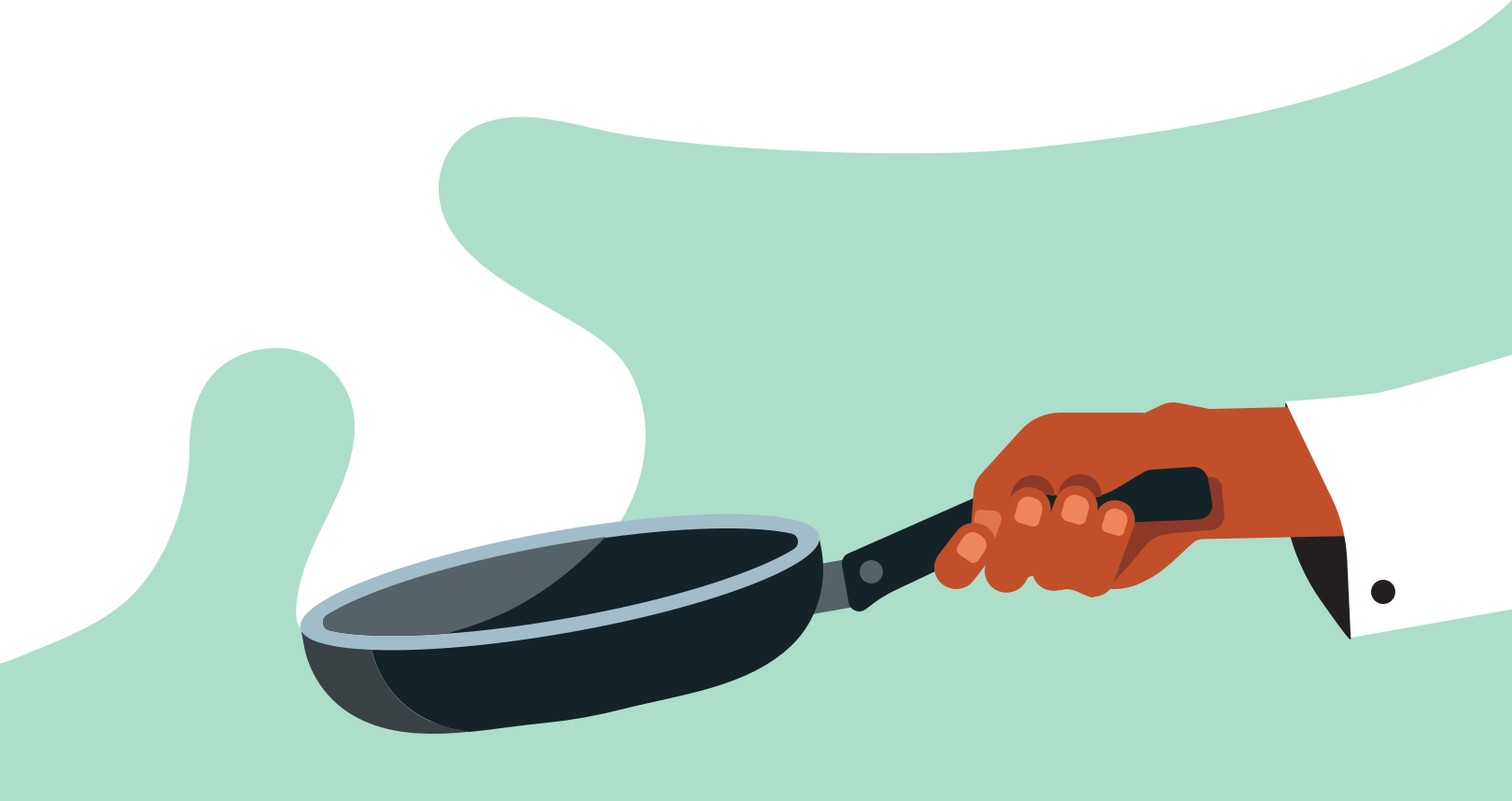
What about sprinkling a little extra-yumminess on this food-related widget by using the powerful illustrations that the Uber team has created?
Colors?
First, the background. We could use a basic #ffffff, but using the Uber colour scheme would make the widget pop a little bit more on the home screen.
I felt that we could make the background slightly green so it would help you recognise it as part of the UberEats colour-scheme and would softly pop on your home screen without being too vibrant. I also feel that it helps attracting user attention.



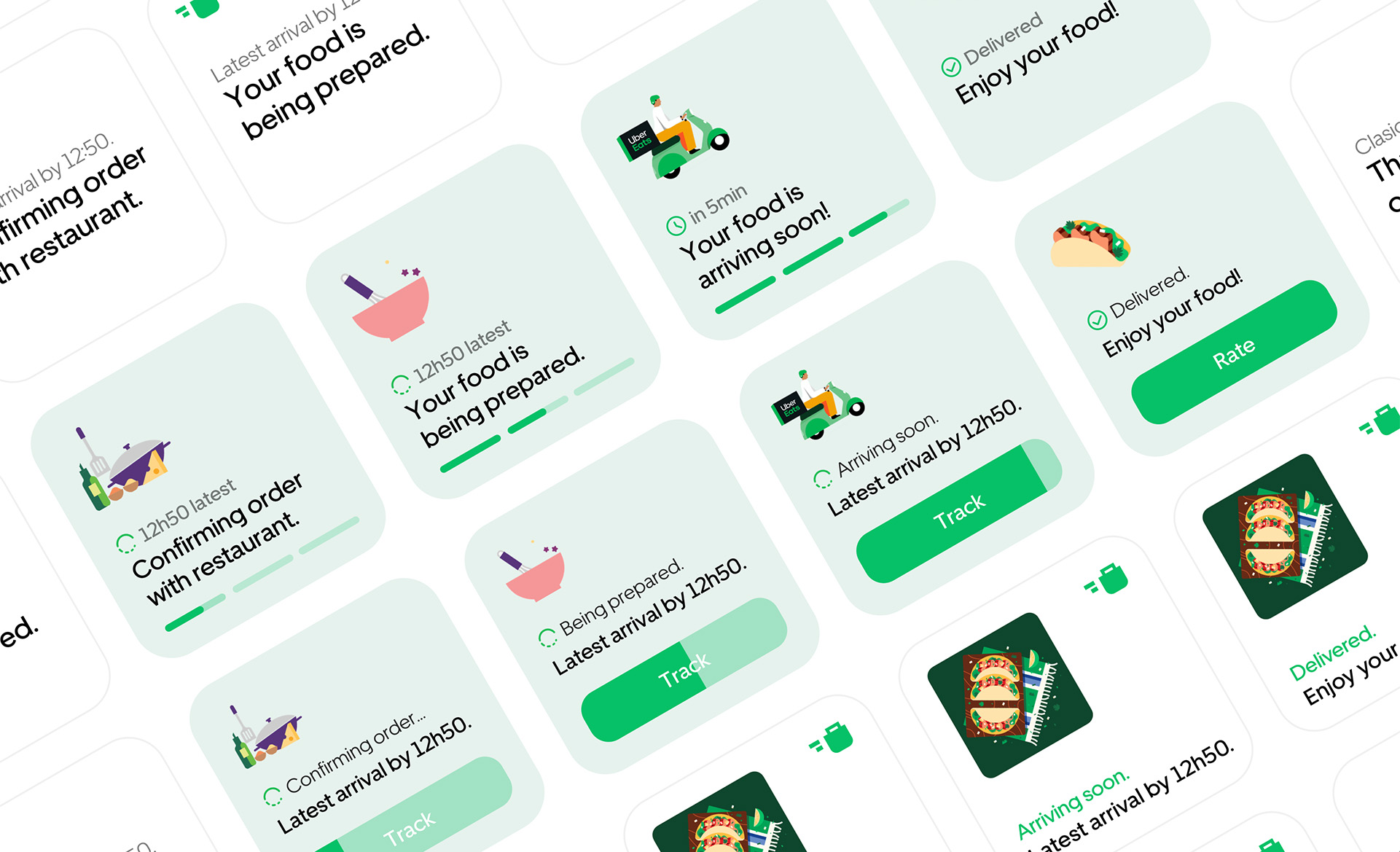
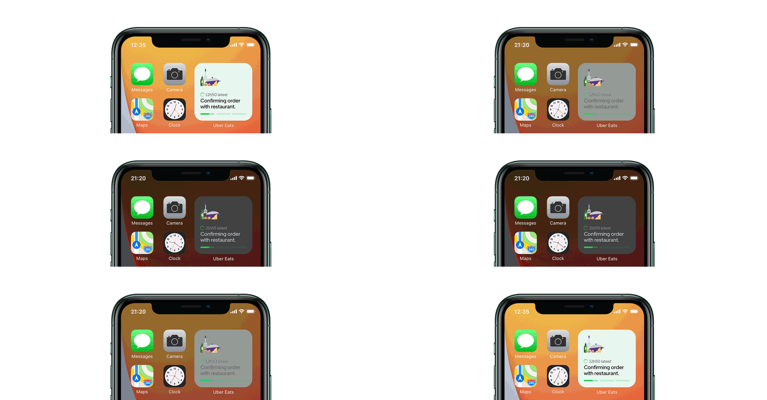
And it even works with Dark Mode ;-)
*This project is not endorsed by, directly affiliated with, maintained, authorized, or sponsored by Uber Technologies, Inc. All product and company names are the registered trademarks of their original owners. The use of any trade name or trademark is for identification and reference purposes only and does not imply any association with the trademark holder of their product brand.
Zürich, CH